The Sales dashboard explained
The Sales dashboard explained
The Sales dashboard is your store's daily pulse: eleven key numbers about revenue, customers and orders — always compared to the previous period. No dashboard-building, no spreadsheet work: open the tab, read the arrows, and you know whether something changed and at which level.
What you will learn
- Use the Sales dashboard
- Read every KPI tile
- Compare any period with the one before
Walkthrough: the Sales dashboard explained (2:48).
Pick a period — the comparison is automatic
At the top you pick the period: use one of the presets, or open the date selector for any custom range — presets go up to three years back, and every window works. The comparison period is set automatically: a period of the same length, right before your selection. That way every number on the page answers the same question — better or worse than before?
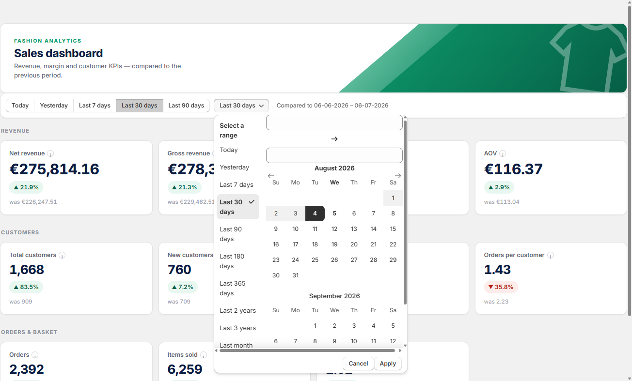
Every tile works the same way
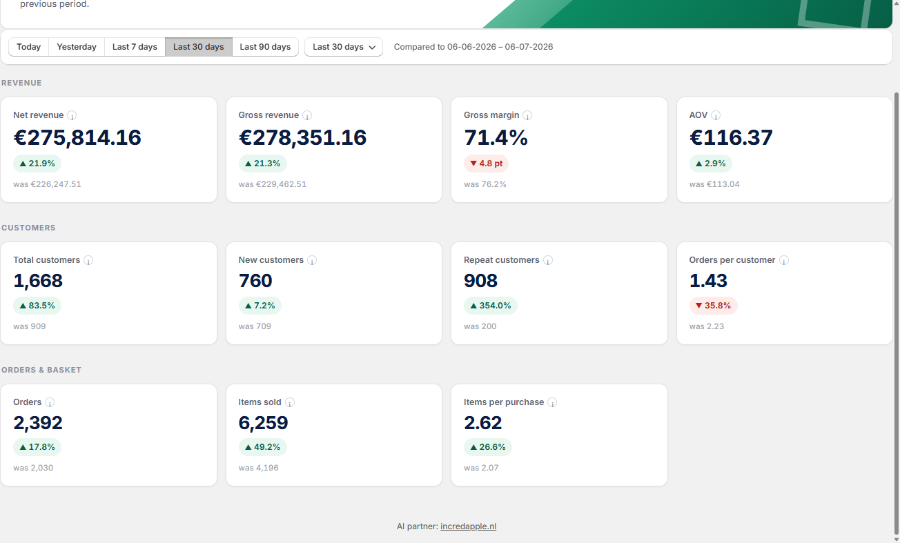
The big number is the value for your selected period. The badge below it shows the change against the comparison period — green means better, red means worse. And under the badge you see the previous value it was compared to. Hover the little "i" next to any tile name for a short explanation — it works the same on every dashboard.
The eleven KPIs, tile by tile
- Net revenue — your real top line: the revenue after product returns.
- Gross revenue — all revenue, before returns. A growing gap with net revenue means returns are taking a bigger bite.
- Gross margin — the total profit margin of the items sold. Watch it during a sale: it shows instantly whether the promotion eats your margin.
- AOV — the average order value: the dial for upsells and bundles.
- Total customers — the number of customers who placed an order in the period.
- New customers — first-time buyers: your acquisition check.
- Repeat customers — returning buyers: your retention check. Repeat revenue is your cheapest revenue.
- Orders per customer — orders divided by customers: a loyalty signal.
- Orders — the total number of orders in the period.
- Items sold — the total units sold.
- Items per purchase — the average number of items per order. Rising means your outfit and cross-sell marketing is working.
💡 Good to know
- After a campaign, set a custom range over exactly the campaign days — the comparison aligns automatically, so you see in one glance whether it sold, whether it kept its margin, and whether it brought new customers.
- "Today" compares a partial day against a complete one — read it in the evening, or compare yesterday against the day before.
- The Sales dashboard tells you that something changed. To see which product did it, jump to the Inventory or Marketing dashboard.
Your store's pulse. Eleven numbers, one glance.
The Sales dashboard gives you your store's pulse — eleven numbers, always against the previous period, so you spot a change the moment it happens.
Still have questions about the Sales dashboard?
We're happy to help you get more out of it.
✉ Email us support@fashion-analytics.com